Advertising Material III (logo, ads, brochures, specialty items, retail display)
The business card
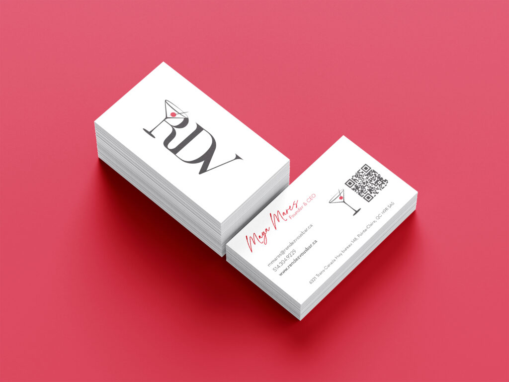
One of the advertising projects I had was this Rendezvous Business Card, in Semester 4’s Design Studio II class, I created a sleek and professional advertising material to extend Rendezvous’ brand identity. Drawing from the restaurant’s clean, modern aesthetic, I designed business cards that reflect its elegant yet approachable vibe.
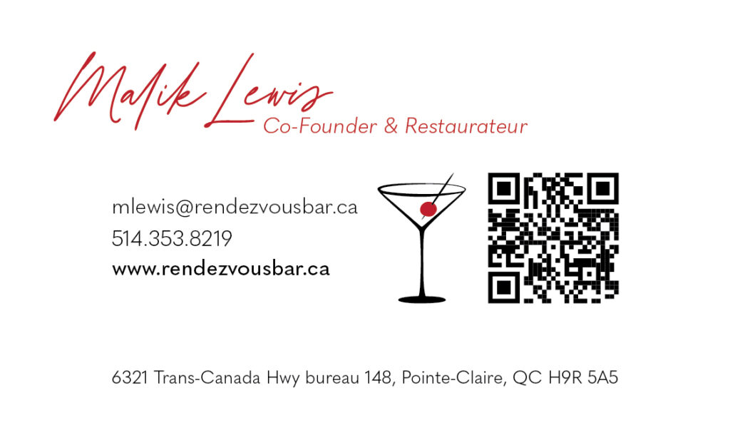
The cards feature the Rendezvous logo prominently on the front, paired with minimal typography and a subtle design on the back to reinforce brand consistency. My focus was on achieving a balance between functionality and sophistication, ensuring the cards would stand out while maintaining a polished, professional look. This project highlights my skills in branding and design, combining creative elements with strategic thinking to produce impactful promotional material.
Here it is, front & back.
The menu
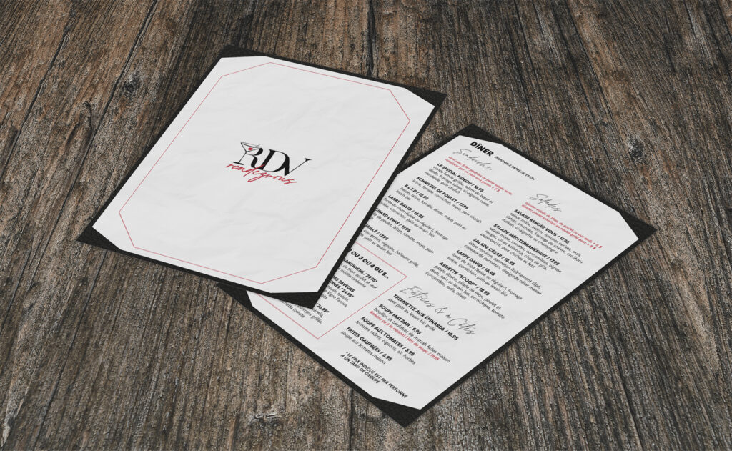
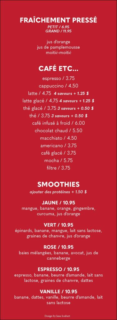
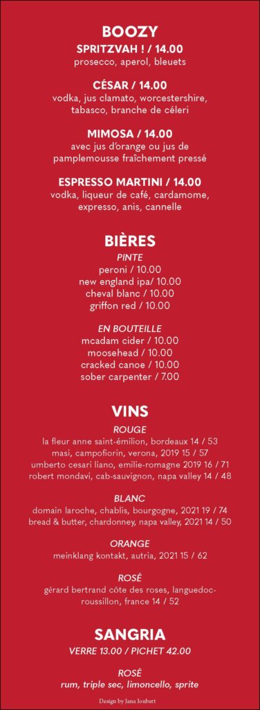
For my Menu Assignment, I designed a detailed and visually appealing restaurant menu for Rendezvous. This menu was crafted to reflect the sophisticated yet welcoming ambiance of the brand, blending functionality with an inviting aesthetic.
The design features a clean, grid-based layout, emphasizing readability while showcasing the diverse range of offerings. The typography choices and structured hierarchy ensure that each section—from breakfast specialties to dinner entrees and drinks—stands out for easy navigation. A cohesive visual language ties the entire menu together, with elegant accents complementing the upscale nature of Rendezvous.
This project highlights my ability to combine practical design principles with branding elements, resulting in a functional yet stylish menu that enhances the customer experience. Through this work, I demonstrated both my creativity and my understanding of design’s role in enhancing a dining brand’s identity.
The magazine ad
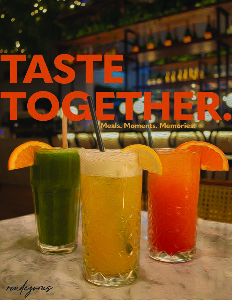
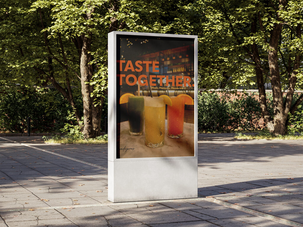
For my Magazine Ad Assignment, I chose to think outside the box by showcasing my advertisement as a billboard instead of a traditional magazine page. The goal was to promote Rendezvous, the fictional café/bar/restaurant brand I developed throughout the semester. Using Adobe Illustrator, I designed a bold and eye-catching ad that would grab attention on a large scale.
The billboard features vibrant imagery and clean typography to convey the brand’s modern and inviting atmosphere. By opting for a billboard format, I wanted to explore how scale and environment can impact the effectiveness of a design. This project allowed me to push my creativity beyond traditional formats, showcasing my ability to adapt my designs to different mediums while maintaining brand consistency. It was a rewarding experience that highlighted the importance of versatility in advertising and design.
