Magazine Cover
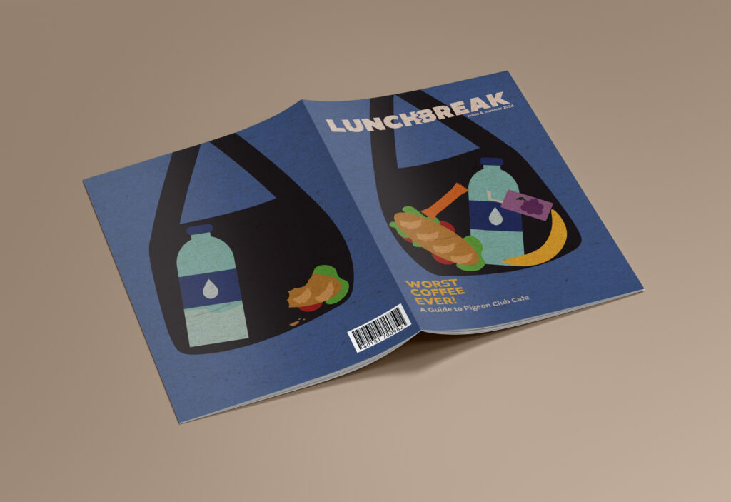
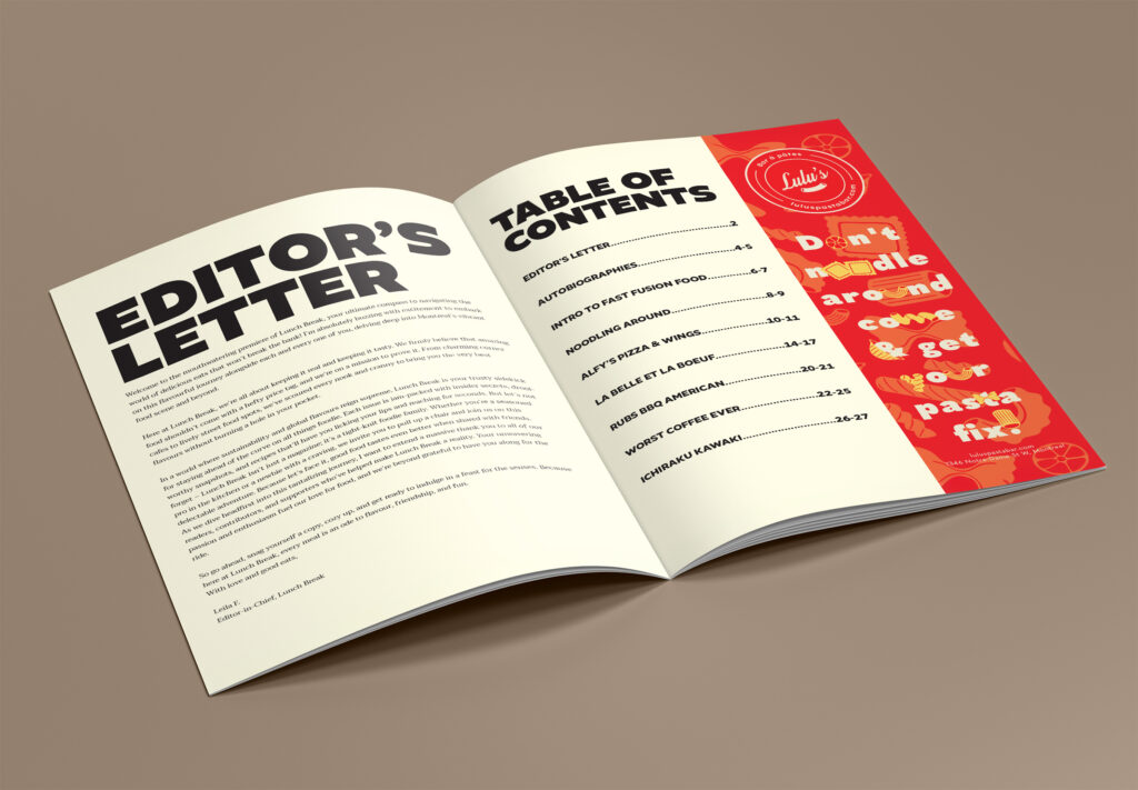
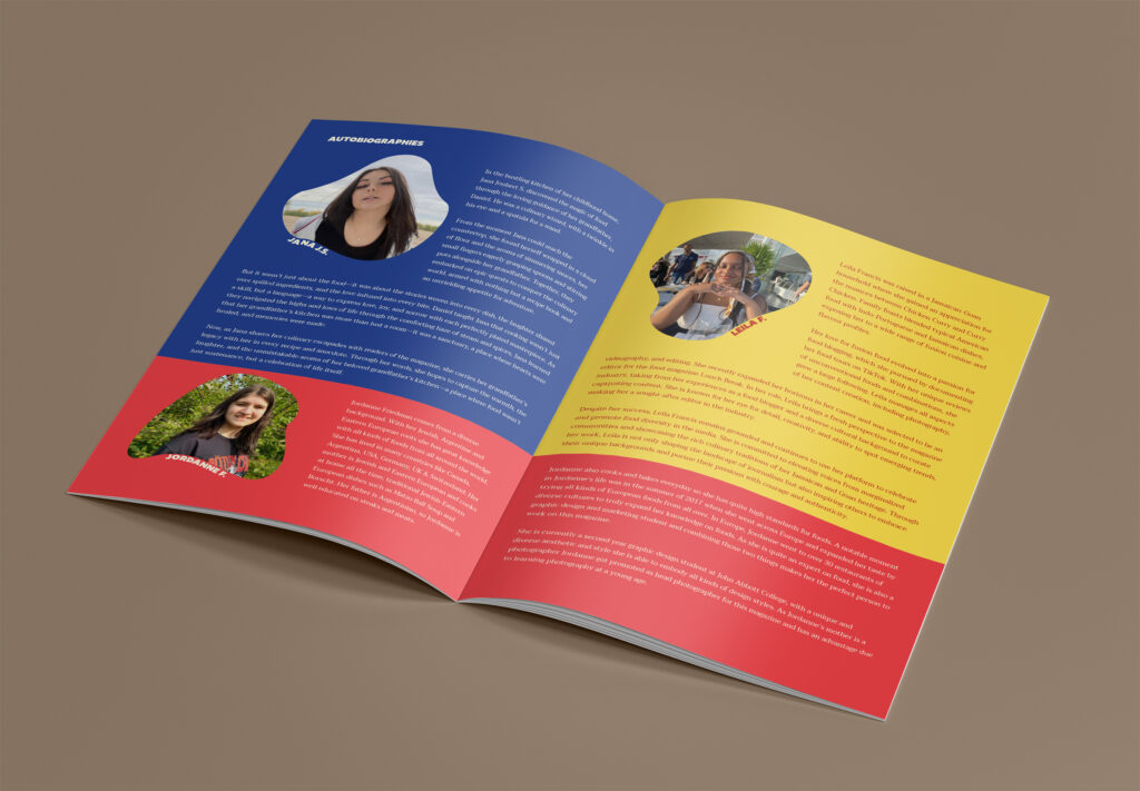
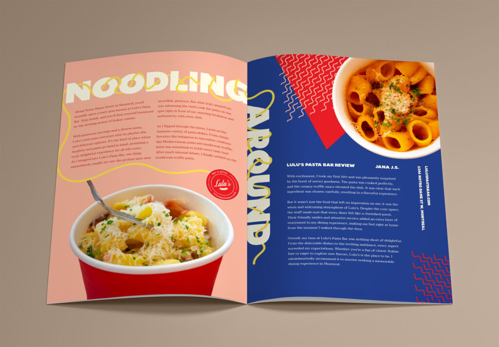
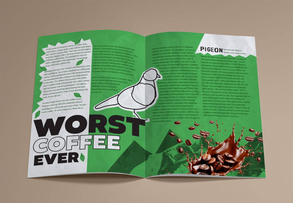
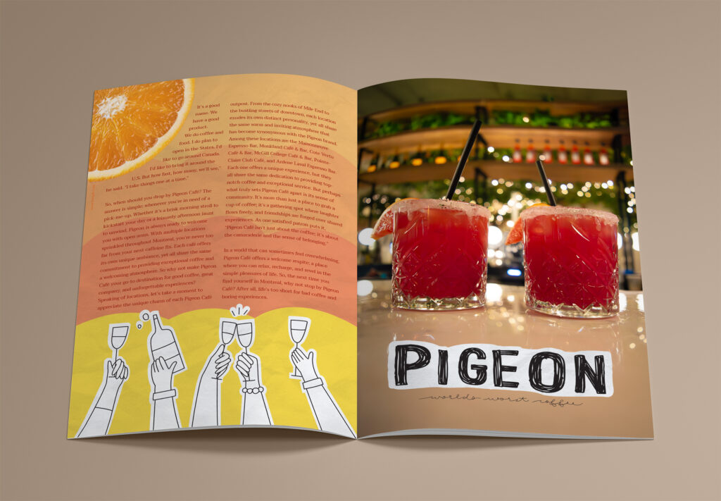
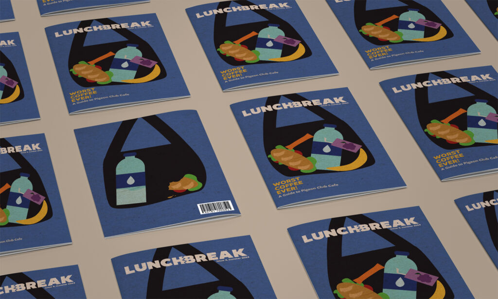
This project, completed in Publication Design II during Semester 4, challenged us to design a cohesive, professional-quality magazine. Our team collaborated on every detail, from concept development to pre-press production, ensuring the final result was polished and engaging magazine, showcasing a range of vibrant layouts and creative typography. I designed the Editor’s Letter and Table of Contents, using bold headlines and a clean structure to establish the magazine’s tone and readability. My pages also featured an article about Lulu’s Pasta Bar, which highlighted playful graphics and dynamic text placement, and a spread for Pigeon Cafe, where I incorporated striking visuals and bold colors to match the article’s quirky tone.
These designs not only reflect my ability to create compelling editorial layouts but also demonstrate my understanding of how to balance aesthetic appeal with functionality. From playful typography to carefully curated color palettes, each page aligns seamlessly with the magazine’s brand identity. This project allowed me to further refine my Adobe InDesign and Illustrator skills while exploring creative storytelling through design. It was an incredible opportunity to translate ideas into visuals that resonate with readers and maintain professional standards.
